
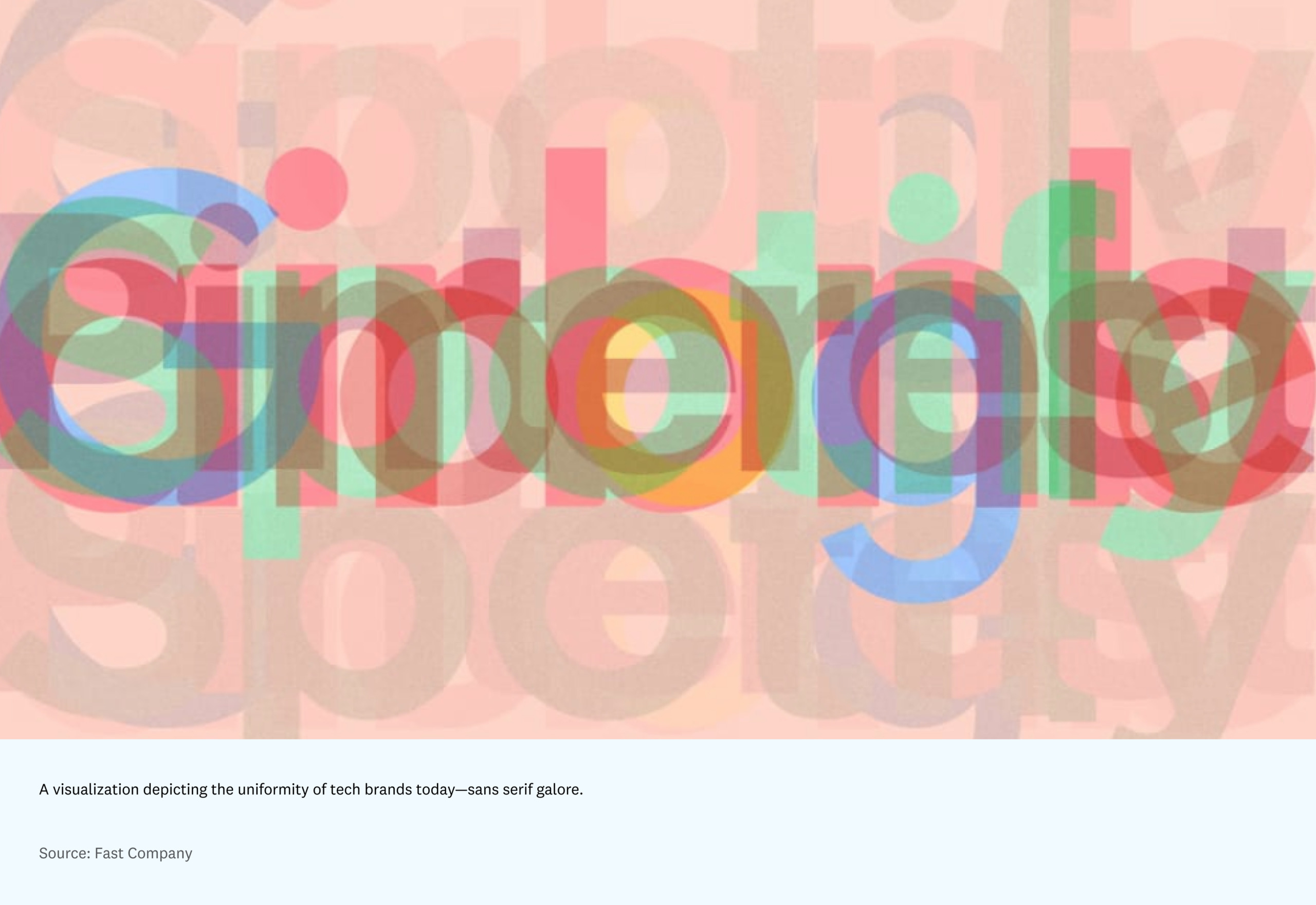
Within the past few years, tech companies’ digital design all started to look the same: marginally, monotonously quirky; safe. From the sans-serif fonts to the muted pastel color palette, the stark white backgrounds to the curvy shape and hue of the buttons, most modern software blurs together into a familiar, squint-and-you’ll-confuse-it aesthetic.
Historically, the look of software has been reactive, reflecting the ethos of the times. And for years, that worked. That autotuned design made products seem cool but accessible; youthful, but trustworthy. More recently, however, that comfortably trendy look has grown tired, as documented in the sea of identical websites.
Modern software’s humdrum lack of identity has resulted in users craving more interesting, opinionated tools, tools that feel like us — or a better, more interesting, wackier version of us.
As technology advances, software will increasingly be chosen not just for how well it addresses its use case, but how it conveys its personality, similar to how we choose our clothes. We’re already beginning to see this shift. In highly individualized spheres like note-taking tools and consumer crypto, software is often chosen based on identity. What we’re witnessing, I’d argue, is the reemergence of style in software: the process of humans recognizing and projecting their sense of self onto products — turning inanimate pixels into something with soul. This shift directly impacts the type of user and community that forms around the product.
Form over function
Since the early days of the modern computing industry — IBM, Hewlett-Packard, and Bell Labs — software developers (who were then also the designers) have prided themselves in caring more about the way something works than the way it looks. Early computing and software stuck to shades of black, white, and beige — the latter ostensibly chosen for its ability to hide signs of aging. This stubborn devotion to form over function fostered a culture that relished the rejection of aesthetics, at least until the 1970s. Impractical visual and emotional appeal wasn’t considered necessary, nor was it supported by computer bandwidth at the time.
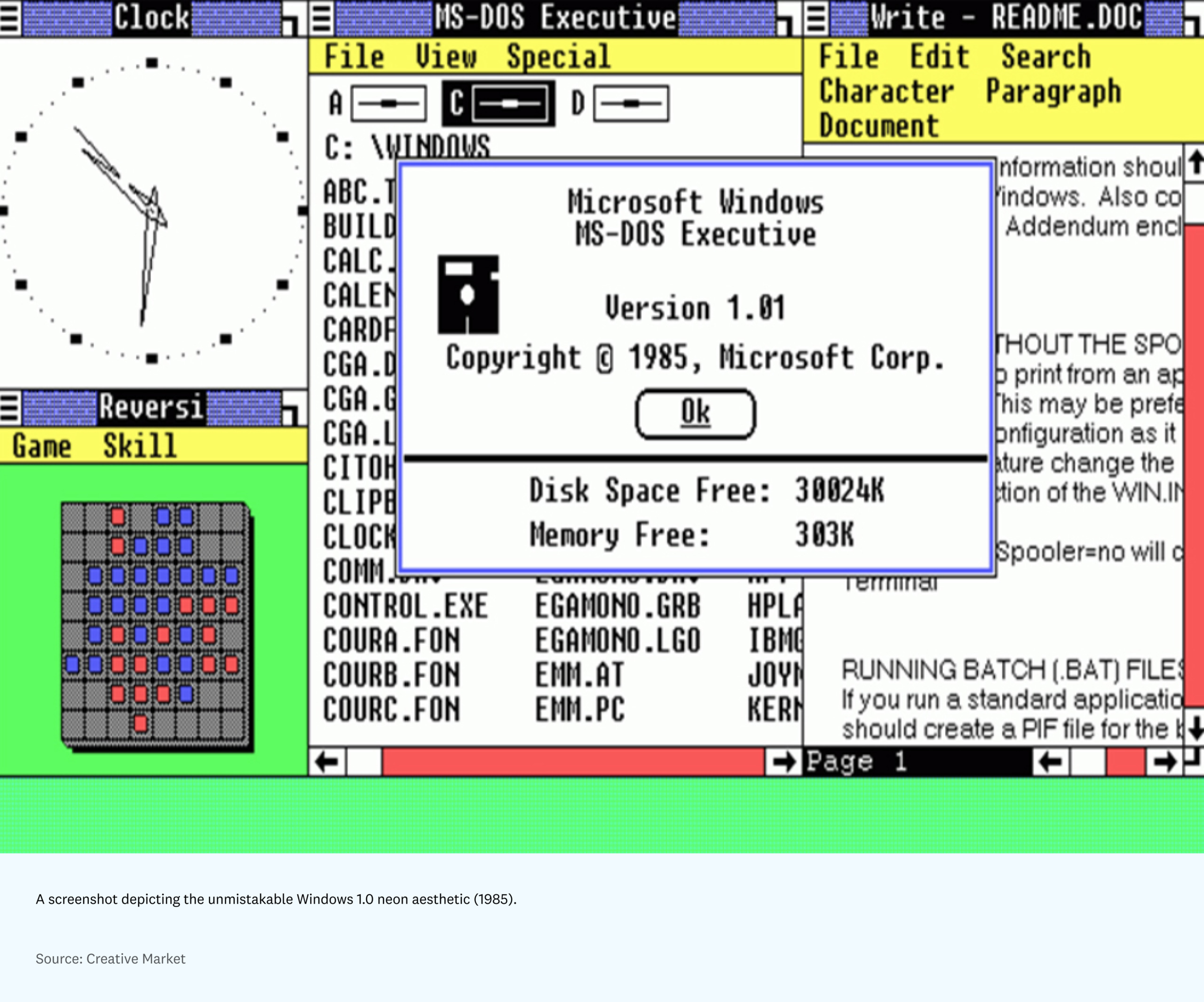
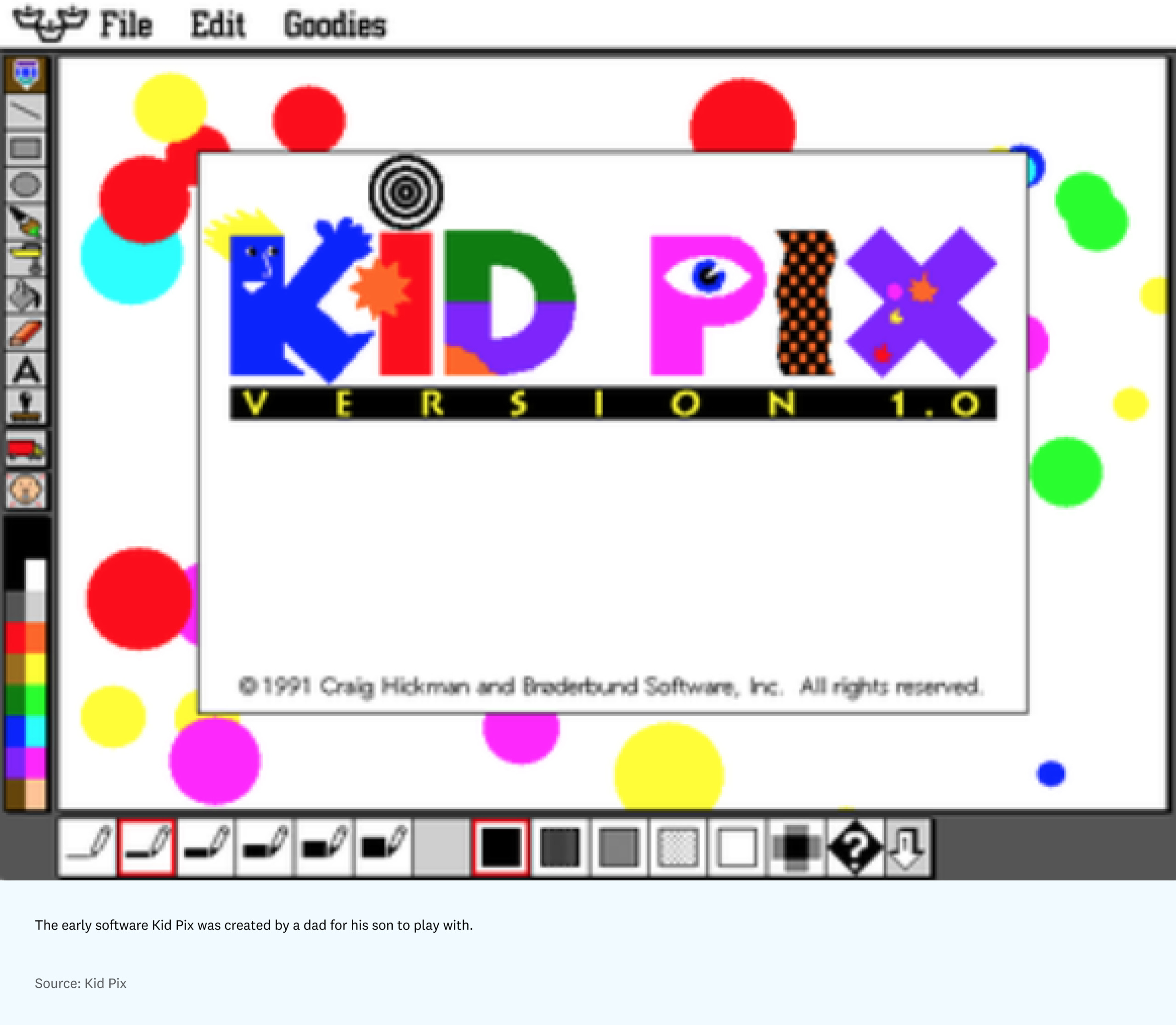
But as the industry advanced in the 1980s and 1990s, more space was created to explore aesthetic choices beyond the basic requirements for functionality. As Nader Salha notes in his book Aesthetics & Art in the Early Development of Human-Computer Interfaces, “Strictly formal, mathematical reasoning had to be combined with informal, intuitive, aesthetic feeling. The gulf between the two cultures — the scientific and the literary — had to be bridged if the small computer on the desktop was to obtain wide acceptance.” This shift could be seen in the Xerox Star’s distinct portrait-oriented display and child-friendly GUI of the ’80s; the patterned, neon design of the early Windows OS (and even the introduction of Clippy); playful early software like Kid Pix; and the translucent, fruit-colored iMacs of the ’90s. All of these products conveyed distinct stylistic opinions about what computing should look and feel like, while implicitly hinting at who should use them.
But at this time, personal computing was still enough of a rarity that software was often created for a highly specific type of person or, in some cases, just one person. Kid Pix, for example, was created by a dad who saw his son struggling to master MacPaint and wanted to make an easier, more fun tool to play with. It didn’t need to have broad appeal, nor was computing broadly available for that purpose.
Fast forward to today and tools are incentivized to expand their market by attempting to solve everything at once. But this means that the market for any given piece of software is often anyone and everyone.
Broad appeal, limited connection
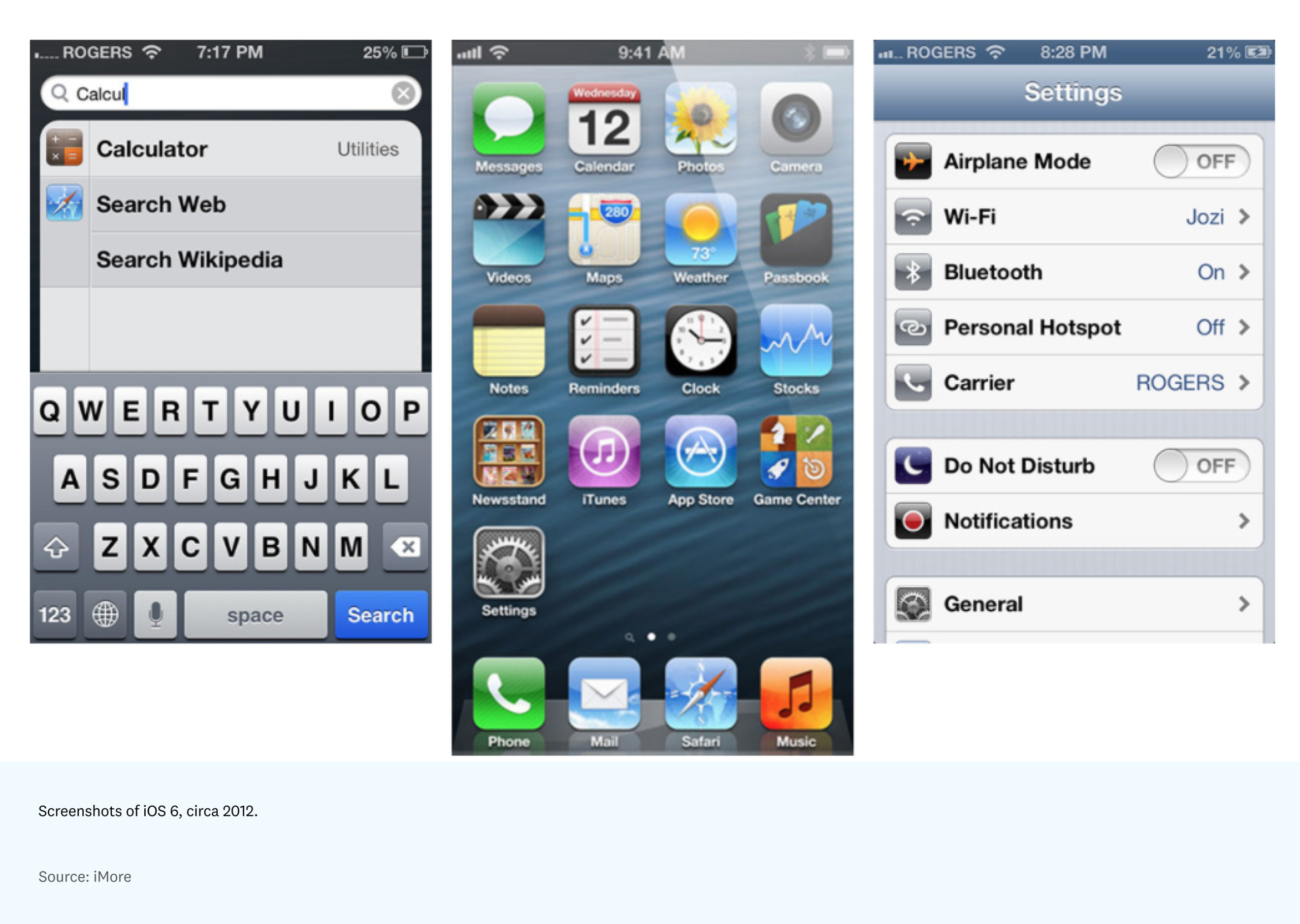
In tandem with the proliferation of software in the 2010s, we saw the rise of an aesthetic style that has come to be known as skeuomorphism. Prominent tech companies like Microsoft and Apple leaned into a visual style that emphasized relatable realism and a shiny veneer, as seen through Windows Vista and iOS 6. These aesthetics were both compelling and immediately understandable to newcomers because they referenced, allegorically, icons (like garbage cans and file folders) that people already understood.
By designing everything on the screen to be as photorealistic as possible, the software essentially negated needing to define its style or stance — it merely reflected the world outside of it.
But as trends in culture shifted to more flat, minimal styles, so followed a wave of tech companies that embraced contemporary branding in a similar manner — much of which feels fundamentally the same. This shared minimal style pulls heavily from Apple-inspired clean curves, Swiss graphic design, misinterpretations of Bauhaus, modern sans serifs, and pastel palettes to create a look that feels familiar and approachable to the target demographic: the modern millennial (and, increasingly, Gen Z).
From Airbnb to Google to Spotify, this era has come to be defined by the commodification of accessible consumer (and now, even enterprise) brands.
By appealing to everyone with these clean lines, gradients, and rounded shapes, no one feels particularly compelled by them. And while these brands serve their purpose in attracting the “right” demographic to their software, they also make it difficult to form a meaningful connection with the user — the product feels like a stylistic blank slate.
A return to specificity
We’ve now come full circle in the world of software and tech brand design. Software started out being specific — designed just for one person even — then expanded to a broader audience by trying to appeal to everyone and losing its identity in the process. In the wake of the uniform brand identity crisis in the tech industry, I believe we need to return to specificity in order to appeal to users more broadly.
But how do software and tool designers do this? What is style in software?
Style is not just an eye-catching color or a fun skeuomorphic icon. Style is the indescribable quality that sums up how interacting with something makes a person feel. It isn’t simply sprinkling bits of color or animations on top of enterprise software to move metrics. It’s the feeling the user gets when everything about a product feels specific to a certain personality that they can identify and relate to.
Style matters to our economy, our society, and to each of us personally — it allows us to communicate who we are and who we want to be. While it is widely understood that style is the driving force behind consumer purchasing decisions in things like clothing, I’d argue that the same has become true in technology and software as well.
Take one example: people are willing to pay $30 a month for an elegant email client, and even be waitlisted, in part because it feels specific and designed to its core — every editorially curated background, communication with the user, and micro-animation is intentional. It’s that style that organically spreads the word about the product to its aesthetically-inclined power users to this day.

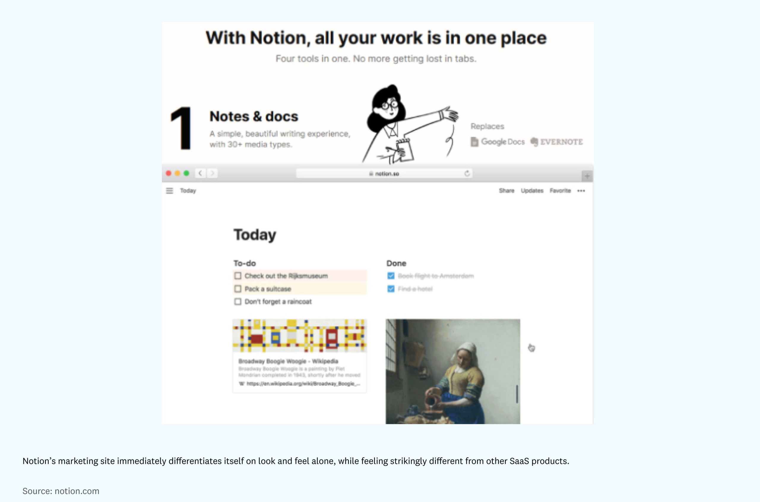
Style is not just about intentionality and appeal, however; it can also be what differentiates software companies like Notion, for instance, at the outset. The app’s serene environment, charismatic illustrations, and playful references to technology history stand out in a crowded marketplace of note-taking apps. While those details were altogether unnecessary from a functionality standpoint, they continue to allow users to resonate with Notion and everything that it stands for, which has in turn fostered the company’s loyal community.
Part of this, I believe, is about bringing back an opinionated approach to software design, where the tool asserts itself. For instance, Linear’s sleek, luminous feel and decisive approach to how work should be done shows how an unwavering commitment to a specific measure of pixel-perfect quality can be incredibly compelling. Similarly, a product like Cash App demonstrates how style within a stagnant industry (in this case a financial tool) feels memorable and intriguing — everything from the company’s illustrations to its tone of voice tells you that this tool is trying (and, for the most part, succeeding) to be seen as cool by the millennial and Gen Z demographic. It’s the clear correlation between Cash App’s style and its mission of “redefining the world’s relationship with money” that makes it feel so magnetic to those it is being marketed to. This ethos is apparent in everything from the brand’s apparel line to editorial-like storytelling work such as “My First Bitcoin and the Legend of Satoshi Nakamoto,” a microsite that tells the story of the features and benefits as a preamble to engaging with the product — all of which feels directly aligned with their mission, and is culturally progressive for the financial sector.
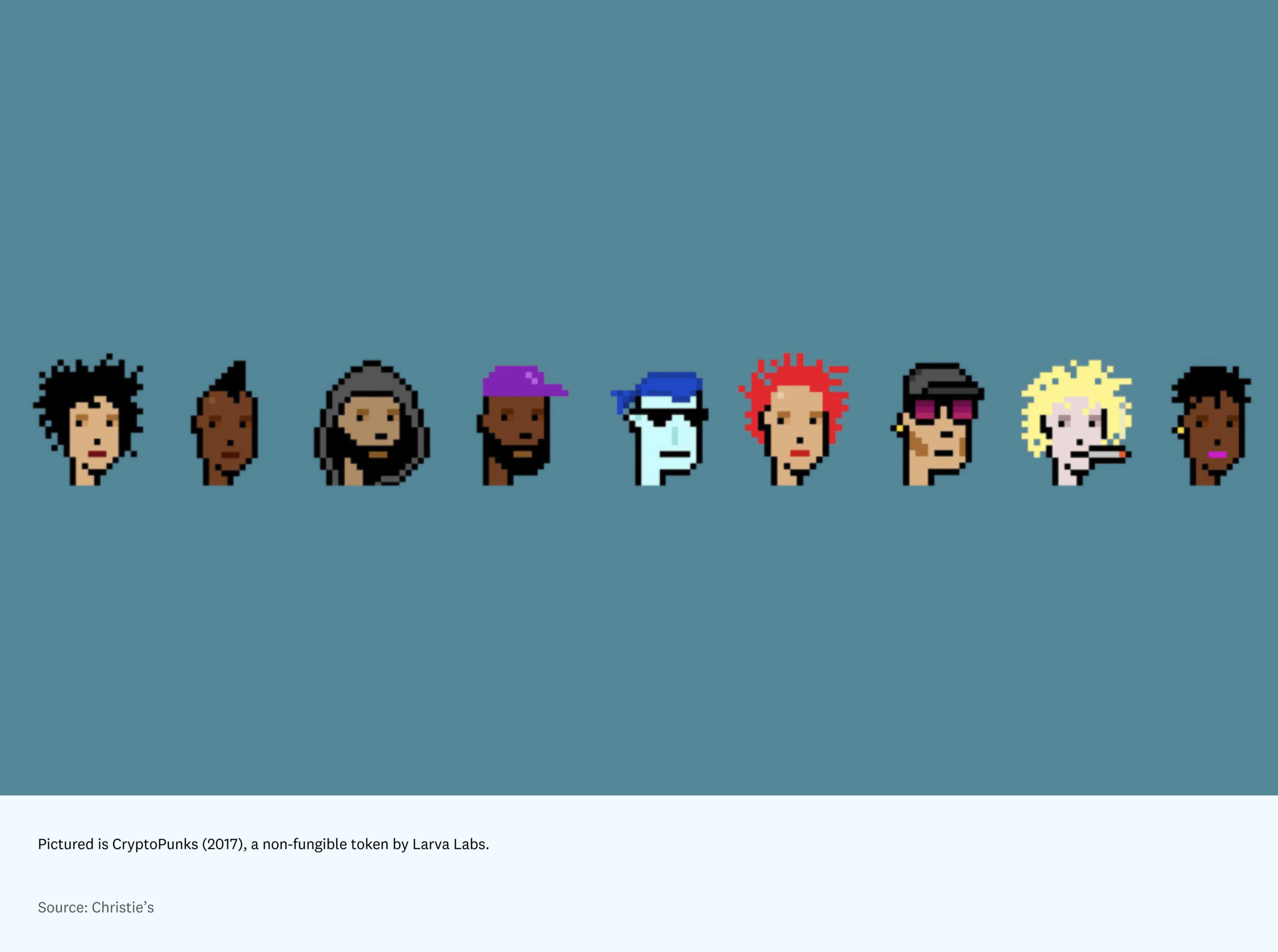
While the aforementioned examples appeal to user appeal, there is also a deeper level to discuss here: community and identity. While crypto historically prioritized function over form, the space has more recently emerged as a leader in experimenting with using style as a competitive advantage. The crypto industry is now an obvious example of how style, identity, and community can come together. But it also pulls heavily from proven stylistic hype patterns from the art and fashion industries — namely auctions and “drops” to generate momentum and create scarcity or early adopter appeal. Once you’re a part of the crypto community, everything from your choice of crypto wallet to which cryptopunk you might decide to purchase is tied to identity.
Looking to the past as a guide for the future
Taking a step back, a broader collective fear around online fatigue — notification overload, too many tools, and too many hours spent scrolling and conferencing — has been articulated, particularly during Covid. This sentiment has spurred a nostalgia for how we used to interact with technology, back when it felt novel, fun, and more of our own choosing.
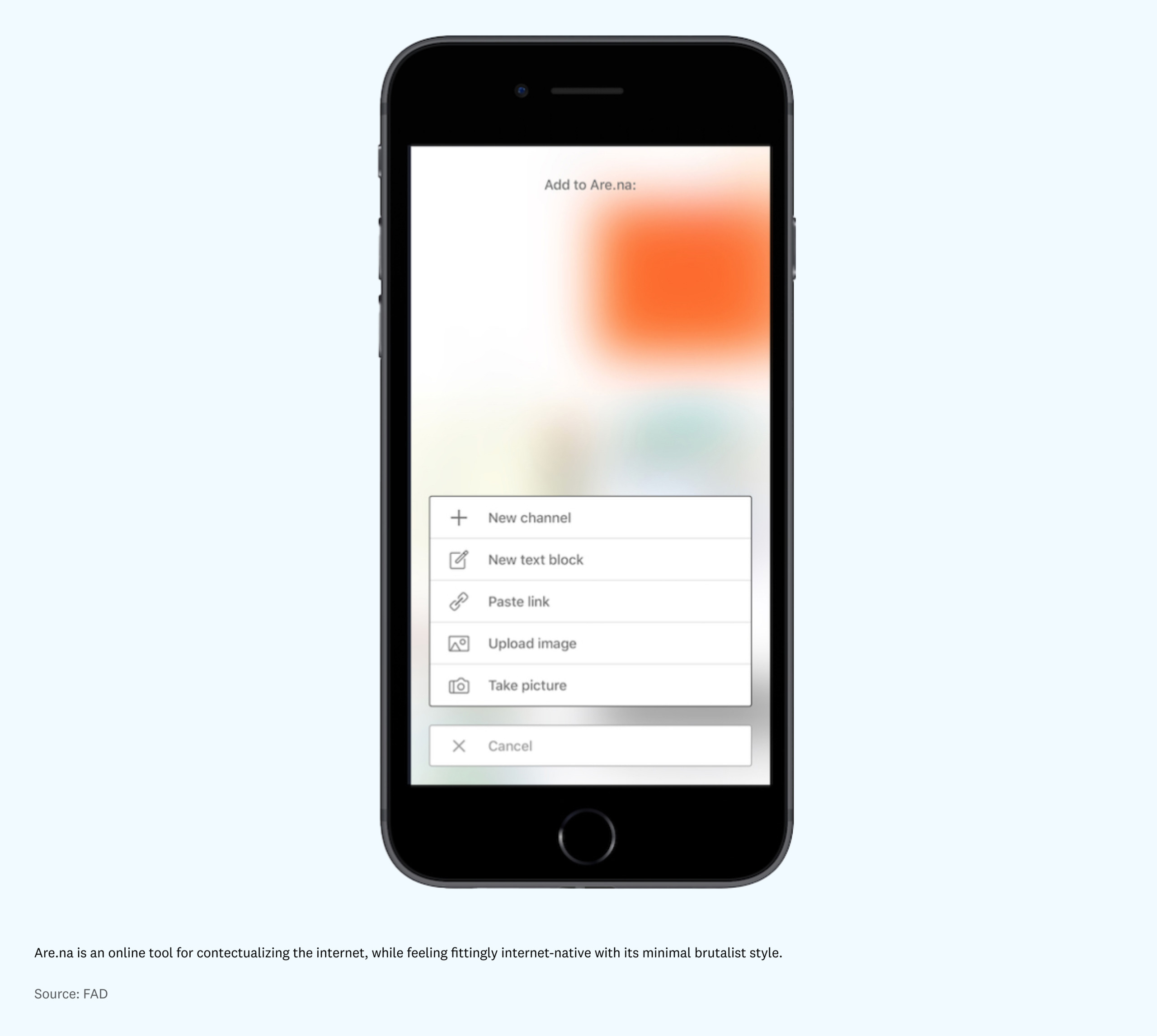
Such nostalgia has been seen, design-wise, in everything from 8-bit and pixel art to Pokemon Go. It’s a more regressive “return” to functionality over form — forms that are unapologetically reflective of the tool’s purpose for a smaller, more specific audience. For this reason, websites like Craigslist and Are.na strike a chord: Their analog internet style and chunky buttons feel daring and intriguing in this modern context. Compared to the blasé, blue-branded modern tools we all spend so much of our time using today — and that contribute to that uniform sameness described earlier — these tools feel decidedly rich with personality. It either resonates with you or not, but it’s almost better to be different in an old way than the same in a new way.
Style can also make rebrand attempts from large tech companies feel as though those companies lack conviction or depth — the brand identities often seem like a flimsy facade that’s disconnected from how we perceive the company’s personality, and actions, in the world. It seems that this dilution of stylistic authenticity occurs frequently when massive companies attempt to unify their look over a multitude of sub-brands, each one becoming a blander version of itself in the name of consistency.
I’d argue that there’s something to be said for retaining stylistic specificity of sub-brands past the point of justification — people care more about stylistic consistency than they do about understanding a unibrand’s org structure (unless it actually impacts their experience using the software). While style is difficult to scale due to variations in employees’ subjective interpretations, it is not impossible. Large companies like Apple that have successfully maintained their stylistic stronghold prove this. It also points to the value of their extensive brand guidelines; intention to hire only for a specific type of style-aware person; and design (or as they call it, user experience) being one of the company’s core founding values.
* * *
Evaluating software by its style — and how it makes us feel — signifies a shift to recognizing tech as a part of our society and identity, as opposed to an inanimate tool without an opinion. Software has become so integrated into our lives that it is no longer simply a utility. Within this new state of the world, style communicates the software’s values and signals the type of person for whom it is intended — something that many tech brands today consistently fail to do.
In a world where “we shape our tools and thereafter our tools shape us” has become common understanding, how will software companies embracing the power of aesthetics reshape the fabric of our culture? And more importantly for designers and builders, how will we choose to shape our working environments to become places where teams holding a similar stylistic vision can build software that feels more human?
Views expressed in “posts” (including articles, podcasts, videos, and social media) are those of the individuals quoted therein and are not necessarily the views of AH Capital Management, L.L.C. (“a16z”) or its respective affiliates. Certain information contained in here has been obtained from third-party sources, including from portfolio companies of funds managed by a16z. While taken from sources believed to be reliable, a16z has not independently verified such information and makes no representations about the enduring accuracy of the information or its appropriateness for a given situation.
This content is provided for informational purposes only, and should not be relied upon as legal, business, investment, or tax advice. You should consult your own advisers as to those matters. References to any securities or digital assets are for illustrative purposes only, and do not constitute an investment recommendation or offer to provide investment advisory services. Furthermore, this content is not directed at nor intended for use by any investors or prospective investors, and may not under any circumstances be relied upon when making a decision to invest in any fund managed by a16z. (An offering to invest in an a16z fund will be made only by the private placement memorandum, subscription agreement, and other relevant documentation of any such fund and should be read in their entirety.) Any investments or portfolio companies mentioned, referred to, or described are not representative of all investments in vehicles managed by a16z, and there can be no assurance that the investments will be profitable or that other investments made in the future will have similar characteristics or results. A list of investments made by funds managed by Andreessen Horowitz (excluding investments for which the issuer has not provided permission for a16z to disclose publicly as well as unannounced investments in publicly traded digital assets) is available at https://a16z.com/investments/.
Charts and graphs provided within are for informational purposes solely and should not be relied upon when making any investment decision. Past performance is not indicative of future results. The content speaks only as of the date indicated. Any projections, estimates, forecasts, targets, prospects, and/or opinions expressed in these materials are subject to change without notice and may differ or be contrary to opinions expressed by others. Please see https://a16z.com/disclosures for additional important information.